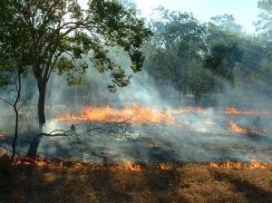
Flinders University Global Ecology postdoc, Dr Farzin Shabani, recently created this astonishing video not only about the results of his models predicting vegetation change in northern Australia as a function of long-term (tens of thousands of years) climate change, but also on the research journey itself!
He provides a brief background to how and why he took up the challenge:
Science would be a lot harder to digest without succinct and meaningful images, graphs, and tables. So, being able to visualise both inputs and outputs of scientific models to cut through the fog of data is an essential element of all science writing and communication. Diagrams help us understand trends and patterns much more quickly than do raw data, and they assist with making comparisons.
During my academic career, I have studied many different topics, including natural hazards (susceptibility & vulnerability risks), GIS-based ensemble modelling, climate-change impacts, environmental modelling at different temporal and spatial scales, species-distribution modelling, and time-series analysis. I use a wide range of graphs, charts, plots, maps and tables to transfer the key messages.
For my latest project, however, I was given the opportunity to make a short animation and visualise my results and the journey itself. I think that my animation inspires a sense of wonder, which is among the most important goals of science education. I also think that my animation draws connections to real-life problems (e.g., ecosystem changes as a product of climate change), and also develops an appreciation of the scientific process itself.
Take a look at let me know what you think!
Read the rest of this entry »


