 Over the years I’ve used a simple graphic from the IPCC 2007 Report to explain to people without a strong background in statistics just why average temperature increases can be deceiving. If you’re not well-versed in probability theory (i.e., most people), it’s perhaps understandable why so few of us appear to be up-in-arms about climate change. I posit that if people had a better appreciation of mathematics, there would be far less inertia in dealing with the problem.
Instead of using the same image, I’ve done up a few basic graphs that explain the concept of why average increases in temperature can be deceiving; in other words, I explain why focussing on the ‘average’ projected increases will not enable you to appreciate the most dangerous aspects of a disrupted climate – the frequency of extreme events. Please forgive me if you find this little explainer too basic – if you have a modicum of probability theory tucked away in your educational past, then this will be of little insight. However, you may wish to use these graphs to explain the problem to others who are less up-to-speed than you.
Let’s take, for example, all the maximum daily temperature data from a single location compiled over the last 100 years. We’ll assume for the moment that there has been no upward trend in the data over this time. If you plot the frequency of these temperatures in, say, 2-degree bins over those 100 years, you might get something like this:
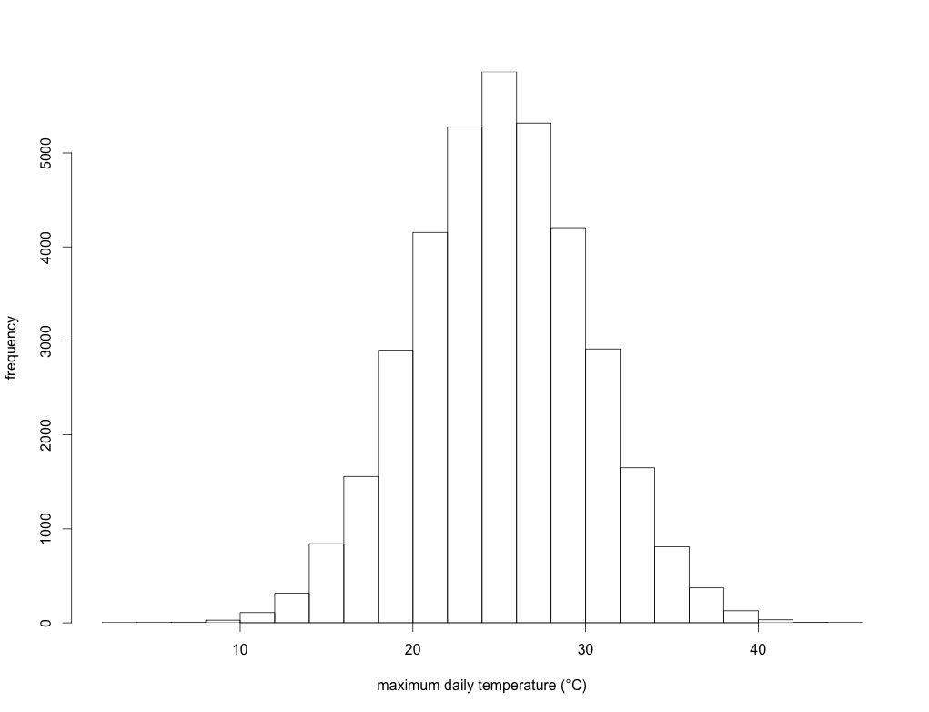
This is simply an illustration, but here the long-term annual average temperature is 25 degrees Celsius, and the standard deviation is 5 degrees. In other words, over those 100 years, the average daily maximum temperature is 25 degrees, but there were a few days when the maximum was < 10 degrees, and a few others where it was > 40 degrees. This could represent a lot of different places in the world.
We can now fit what’s known as a ‘probability density function’ to this histogram to obtain a curve of expected probability of any temperature within that range:
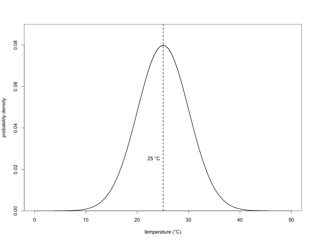
If you’ve got some background in statistics, then you’ll know that this is simply a normal (Gaussian) distribution. With this density function, we can now calculate the probability of any particular day’s maximum temperature being above or below any particular threshold we choose. In the case of the mean (25 degrees), we know that exactly half (p = 0.50) of the days will have a maximum temperature below it, and exactly half above it. In other words, this is simply the area under the density function itself (the total area under the entire curve = 1). Read the rest of this entry »


