While I’m currently in Github mode (see previous post), I thought I’d share a list of resources I started putting together for learning and upskilling in the R programming language.
If you don’t know what R is, this probably won’t be of much use to you. But if you are a novice user, want to improve your skills, or just have access to a kick-arse list of cheatsheets, then this Github repository should be useful.
I don’t claim that this list is exhaustive, nor do I vouch for the quality of any of the listed resources. Some of them are deprecated and fairly old too, so be warned.
The first section includes online resources such as short courses, reference guides, analysis demos, tips for more-efficient programming, better plotting guidelines, as well as some R-related mini-universes like markdown, ggplot, Shiny, and tidyverse.
The section following is a list of popular online communities, list-servers, and blogs that help R users track down advice for solving niggly coding and statistical problems.
The next section is a whopping-great archive of R cheatsheets, covering everything from the basics, plotting, cartography, databasing, applications, time series analysis, machine learning, time & date, building packages, parallel computing, resampling methods, markdown, and more.
If you use genetics to differentiate populations, the new package smartsnp might be your new friend. Written in R language and available from GitHub and CRAN, this package does principal component analysis with control for genetic drift, projects ancient samples onto modern genetic space, and tests for population differences in genotypes. The package has been built to load big datasets and run complex stats in the blink of an eye, and is fully described in a paper published in Methods in Ecology and Evolution (1).
In the bioinformatics era, sequencing a genome has never been so straightforward. No surprise that > 20 petabytes of genomic data are expected to be generated every year by the end of this decade (2) — if 1 byte of information was 1 mm long, we could make 29,000 round trips to the moon with 20 petabytes. Data size in genetics keeps outpacing the computer power available to handle it at any given time (3). Many will be familiar with a computer freezing if unable to load or run an analysis on a huge dataset, and how many coffees or teas we might have drunk, or computer screens might have been broken, during the wait. The bottom line is that software advances that speed up data processing and genetic analysis are always good news.
With that idea in mind, I have just published a paper presenting the new R package smartsnp (1) to run multivariate analysis of big genotype data, with applications to studies of ancestry, evolution, forensics, lineages, and overall population genetics. I am proud to say that the development of the package has been one of the most gratifying short-term collaborations in my entire career, with my colleagues Christian Huber and Ray Tobler: a true team effort!
The package is available on GitHub and the Comprehensive R Archive Network CRAN. See downloading options here, and vignettes here with step-by-step instructions to run different functionalities of our package (summarised below).
In this blog, I use “genotype” meaning the combination of gene variants (alleles) across a predefined set of positions (loci) in the genome of a given individual of animal, human, microbe, or plant. One type of those variants is single nucleotide polymorphisms (SNP), a DNA locus at which two or more alternative nucleotides occur, sometimes conditioning protein translation or gene expression. SNPs are relatively stable over time and are routinely used to identify individuals and ancestors in humans and wildlife.
What the package does
The package smartsnp is partly based on the field-standard software EIGENSOFT (4, 5) which is only available for Unix command-line environments. In fact, our driving motivation was (i) to broaden the use of EIGENSOFT tools by making them available to the rocketing community of professionals, not only academics who employ R for their work (6), and (ii) to optimise our package to handle big datasets and complex stats efficiently. Our package mimics EIGENSOFT’s principal component analysis (SMARTPCA) (5), and also runs multivariate tests for population differences in genotypes as follows:
However, this time I’ve strayed from my recent bibliometric musings and developed something that’s more compatible with the core of my main research and interests.
Over the years I’ve taught many students the basics of population modelling, with the cohort-based approaches dominating the curriculum. Of these, the simpler ‘Leslie’ (age-classified) matrix models are both the easiest to understand and for which data can often be obtained without too many dramas.
But unless you’re willing to sit down and learn the code, they can be daunting to the novice.
Sure, there are plenty of software alternatives out there, such as Bob Lacy‘s Vortex (a free individual-based model available for PCs only), Resit Akçakaya & co’s RAMAS Metapop ($; PC only), Stéphane Legendre‘s Unified Life Models (ULM; open-source; all platforms), and Charles Todd‘s Essential (open-source; PC only) to name a few. If you’re already an avid R user and already into population modelling, you might be familiar with the population-modelling packages popdemo, OptiPopd, or sPop. I’m sure there are still other good resources out there of which I’m not aware.
But, even to install the relevant software or invoke particular packages in R takes a bit of time and learning. It’s probably safe to assume that many people find the prospect daunting.
It’s for this reason that I turned my newly acquired R Shiny skills to matrix population models so that even complete coding novices can run their own stochastic population models.
I had an interesting ‘discussion’ on Twitter yesterday that convinced me the topic would make a useful post. The specific example has nothing whatsoever to do with conservation, but it serves as a valuable statistical lesson for all concerned about demonstrating adequate evidence before jumping to conclusions.
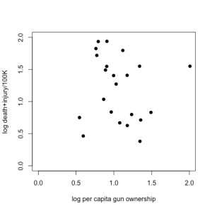
Now, if you’re an empirical skeptic like me, there was something fishy about that fitted trend line. So, I replotted the data (available here) using Plot Digitizer (if you haven’t yet discovered this wonderful tool for lifting data out of figures, you would be wise to get it now), and ran a little analysis of my own in R:
Just doing a little 2-parameter linear model (y ~ α + βx) in R on these log-log data (which means, it’s assumed to be a power relationship), shows that there’s no relationship at all — the intercept is 1.3565 (± 0.3814) in log space (i.e., 101.3565 = 22.72), and there’s no evidence for a non-zero slope (in fact, the estimated slope is negative at -0.1411, but it has no support). See R code here.
Now, the author pointed out what appears to be a rather intuitive requirement for this analysis — you should not have a positive number of gun-related deaths/injuries if there are no guns in the population; in other words, the relationship should be forced to go through the origin (x, y = 0, 0). You can easily do this in R by using the lm function and setting the relationship to y ~ 0 + x; see code here). Read the rest of this entry »
Over the years I’ve used a simple graphic from the IPCC 2007 Report to explain to people without a strong background in statistics just why average temperature increases can be deceiving. If you’re not well-versed in probability theory (i.e., most people), it’s perhaps understandable why so few of us appear to be up-in-arms about climate change. I posit that if people had a better appreciation of mathematics, there would be far less inertia in dealing with the problem.
Instead of using the same image, I’ve done up a few basic graphs that explain the concept of why average increases in temperature can be deceiving; in other words, I explain why focussing on the ‘average’ projected increases will not enable you to appreciate the most dangerous aspects of a disrupted climate – the frequency of extreme events. Please forgive me if you find this little explainer too basic – if you have a modicum of probability theory tucked away in your educational past, then this will be of little insight. However, you may wish to use these graphs to explain the problem to others who are less up-to-speed than you.
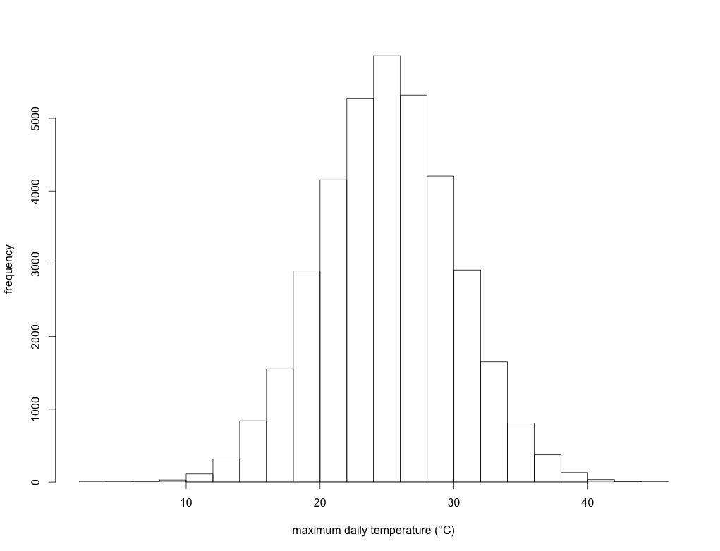
Let’s take, for example, all the maximum daily temperature data from a single location compiled over the last 100 years. We’ll assume for the moment that there has been no upward trend in the data over this time. If you plot the frequency of these temperatures in, say, 2-degree bins over those 100 years, you might get something like this:
This is simply an illustration, but here the long-term annual average temperature is 25 degrees Celsius, and the standard deviation is 5 degrees. In other words, over those 100 years, the average daily maximum temperature is 25 degrees, but there were a few days when the maximum was < 10 degrees, and a few others where it was > 40 degrees. This could represent a lot of different places in the world.
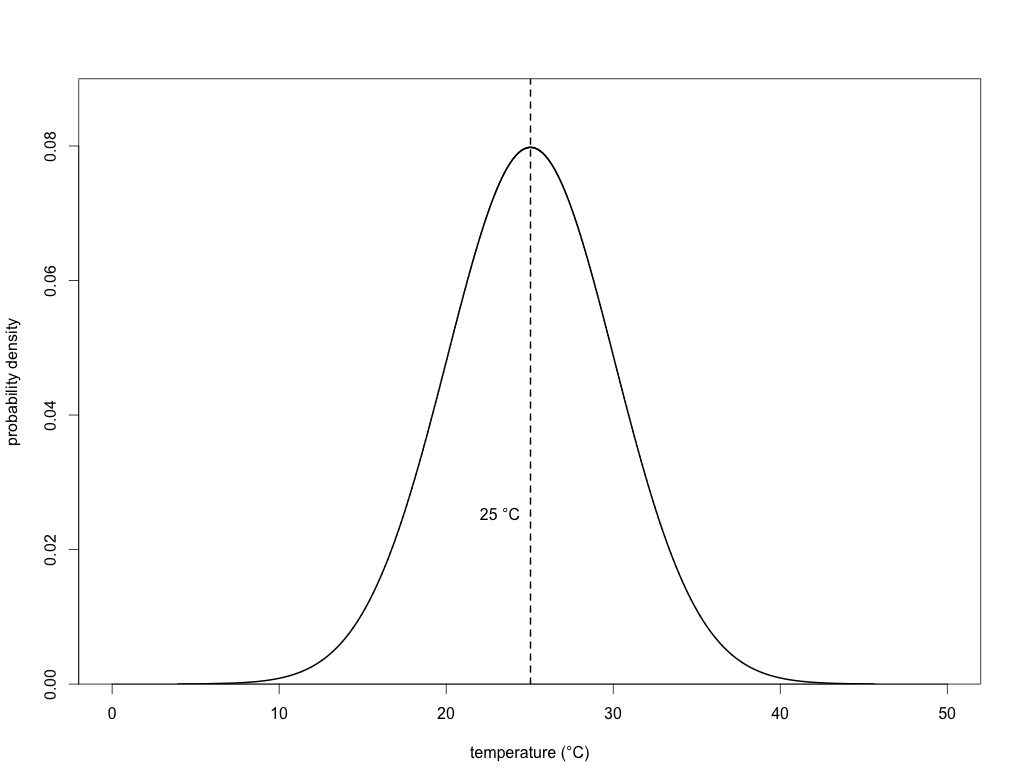
We can now fit what’s known as a ‘probability density function’ to this histogram to obtain a curve of expected probability of any temperature within that range:
If you’ve got some background in statistics, then you’ll know that this is simply a normal (Gaussian) distribution. With this density function, we can now calculate the probability of any particular day’s maximum temperature being above or below any particular threshold we choose. In the case of the mean (25 degrees), we know that exactly half (p = 0.50) of the days will have a maximum temperature below it, and exactly half above it. In other words, this is simply the area under the density function itself (the total area under the entire curve = 1). Read the rest of this entry »
If you’ve been following this blog for a while, you’ll be no stranger to my views on what I believe is one of the most abused, and therefore now meaningless, words in scientific writing: ‘significance’ and her adjective sister, ‘significant’. I hold that it should be stricken entirely from the language of science writing.
Most interviews on radio or television, most lectures by politicians or business leaders, and nearly all presentations by academics at meetings of learned societies invoke ‘significant’ merely to add emphasis to the discourse. Usually it involves some sort of comparison – a ‘significant’ decline, a ‘significant’ change or a ‘significant’ number relative to some other number in the past or in some other place, and so on. Rarely is the word quantified: how much has the trend declined, how much did it change and how many is that ‘number’? What is ‘significant’ to a mouse is rather unimportant to an elephant, so most uses are as entirely subjective qualifiers employed to add some sort of ‘expert’ emphasis to the phenomenon under discussion. To most, ‘significant’ just sounds more authoritative, educated and erudite than ‘a lot’ or ‘big’. This is, of course, complete rubbish because it is the practice of using big words to hide the fact that the speaker isn’t quite as clever as he thinks he is.
While I could occasionally forgive non-scientists for not quantifying their use of ‘significance’ because they haven’t necessarily been trained to do so, I utterly condemn scientists who use the word that way. We are specifically trained to quantify, so throwing ‘significant’ around without a very clear quantification (it changed by x amount, it declined by 50 % in two years, etc.) runs counter to the very essence of our discipline. To make matters worse, you can often hear a vocal emphasis placed on the word when uttered, along with a patronising hand gesture, to make that subjectivity even more obvious.
If you are a scientist reading this, then you are surely waiting for my rationale as to why we should also ignore the word’s statistical meaning. While I’ve explained this before, it bears repeating. Read the rest of this entry »
Organism abundance is the parameter most often requiring statistical treatment. Statistics turn our field/lab notes into estimates of population density after considering the individuals we can see and those we can’t. Later, statistical analyses will relate our density estimates to other factors (climate, demography, genetics, human impacts), allowing the examination of key issues such as extinction risk, biomonitoring or ecosystem services (humus formation, photosynthesis, pollination, fishing, etc.). Photos – top: a patch of fungi (Lacandon Jungle, Mexico), next down: a palm forest (Belize river, Belize), next down: an aggregation of butterflies (Amazon, Peru), and bottom: a group of river dolphins (Amazon, Colombia). Photos by Salvador Herrando-Pérez.
Another interesting and provocative post from my (now ex-) PhD student, Dr. Salvador Herrando-Pérez. After reading this post, you might be surprised to know that Salva was one of my more quantitative students, and although he struggled to keep up with the maths at times, he eventually become quite an efficient ecological modeller (see for yourself in his recent publications here and here).
—
When an undergraduate faces the prospect of a postgraduate degree (MSc/PhD), he or she is often presented with an overwhelming contradiction: the host university expects the student to have statistical skills for which he/she might never have received instruction. This void in the education system forges professionals lacking statistical expertise, skills that are mandatory for cutting-edge research!
Universities could provide the best of their societal services if, instead of operating in isolation, they integrated the different phases of academic training students go through until they enter the professional world. Far from such integration in the last 20 years, universities have become a genuine form of business and therefore operate competitively. Thus, they seek public and private funding by means of student fees (lecturing), as well as publications and projects developed by their staff (research). In this kind of market-driven academia, we need indicators of education quality that quantify the degree by which early-career training methods make researchers useful, innovative and cost-effective for our societies, particularly in the long term.
More than a century ago, the geologist and educator Thomas Chamberlin (1) distinguished acquisitive from creative learning methods. The former are “an attempt to follow by close imitation the processes of other thinkers and to acquire the results of their investigation by memorising”. The latter represent “the endeavour… to discover new truth or to make a new combination of truth or at least to develop by one’s own effort an individualised assemblage of truth… to think for one’s self”. From the onset of their academic training, students of many countries are instructed in acquisitive methods of learning that reward the retention of information, much of which falls into oblivion after being regurgitated during an exam. Apart from being a colossal waste of resources (because it yields near null individual or societal benefits), this vicious machinery is reinforced by reward and punishment in convoluted manners. For instance, one of my primary-school teachers had boys seated in class by a ‘ranking of intelligence’; so one could lose the first seat if the classmate in the second seat answered a question correctly, which the up-to-then ‘most intelligent’ had failed to hit. Read the rest of this entry »
Some automated stats from WordPress on ConservationBytes.com.
—
The stats helper monkeys at WordPress.com mulled over how this blog did in 2010, and here’s a high level summary of its overall blog health:
The Blog-Health-o-Meter™ reads Wow.
Crunchy numbers
The Louvre Museum has 8.5 million visitors per year. This blog was viewed about 130,000 times in 2010. If it were an exhibit at The Louvre Museum, it would take 6 days for that many people to see it.
In 2010, there were 105 new posts, growing the total archive of this blog to 287 posts. There were 208 pictures uploaded, taking up a total of 29mb. That’s about 4 pictures per week.
The busiest day of the year was November 12th with 816 views. The most popular post that day was One billion people still hungry.
Where did they come from?
The top referring sites in 2010 were stumbleupon.com, twitter.com, adelaide.edu.au, facebook.com, and researchblogging.org.
Some visitors came searching, mostly for sharks, inbreeding, network, impact factor 2009, and extinction vortex.
Attractions in 2010
These are the posts and pages that got the most views in 2010.
While travelling to our Supercharge Your Scienceworkshop in Cairns and Townsville last week (which, by the way, went off really well and the punters gave us the thumbs up – stay tuned for more Supercharge activities at a university near you…), I stumbled across an article in the Sydney Morning Herald about the state of Australia.
That Commonwealth purveyor of numbers, the Australian Bureau of Statistics (ABS), put together a nice little summary of various measures of wealth, health, politics and environment and their trends over the last decade. The resulting Measures of Australia’s Progress is an interesting read indeed. I felt the simple newspaper article didn’t do the environmental components justice, so I summarise the salient points below and give you my tuppence as well. Read the rest of this entry »
Just over two years ago I reported the ‘likely’ eradication of feral pigs from Australia’s third-largest (4,405 km2) island — Kangaroo Island. I indicated ‘likely’ because the program still required the proof-of-eradication phase to be completed before an official declaration could be made. Yesterday I had the immense honour to take part in the official…
Have you ever done any research that relied to any degree on Indigenous Knowledges? How did you cite those Knowledges, if at all? It’s probably time we rethink how we engage with Indigenous Knowledge systems. In a new article published in BioScience, we — a large group of Indigenous and non-Indigenous scholars in Australia —…
A recent paper, co-authored with the late Paul Ehrlich, reveals that the global human population has surpassed Earth’s sustainable capacity. It highlights the dire implications for food security, climate stability, and wellbeing. The study underscores that immediate changes in consumption and population management are crucial for a sustainable future.


 I had an interesting ‘discussion’ on