Best and worst countries by different environmental indicators

15 06 2022

I’ll preface this post with a caveat — the data herein are a few years old (certainly pre-COVID), so things have likely changed a bit. Still, I think the main message holds.


Many years ago, I compiled seven different national-level measures of environmental degradation to show that countries with the largest human populations, and hence, the largest economies, had done the most environmental damage — not only to their own resources, but to the world’s in general.

That last observation is important because there are really two main ways to quantify a country’s environmental performance. First, there is its relative environmental damage, which essentially means what proportion of its own resources a country has pilfered or damaged. This type of measure standardises the metrics to account for the different areas of countries (e.g., Russia versus Singapore) and how much of, say, forests, they had to start with, and what proportion of them they have thus far destroyed.

Looking at it this way, small countries with few large-scale industries came out in the lead as the least-damaged environmentally — the least environmentally damaged country according this metric is Cape Verde (followed by Central African Republic, Swaziland, Niger, and Djibouti).

However, another way to look at it is how much of the overall contribution to the world’s environmental damage each country is responsible, which of course implies that the countries with the highest amounts of resources damaged in absolute terms (i.e., the biggest, most populous ones) disproportionately contribute more to global environmental damage.

Using this absolute metric, the countries with the greatest overall damage are Brazil (largely due to the destruction of the Amazon and its other forests), the USA (for its greenhouse-gas emissions and conversion of its prairies to farmland), and China (for its water pollution, deforestation, and carbon emissions). On the flip side, this means that the smallest countries with the fewest people are ranked ‘better’ because of their lower absolute contribution to the world’s total environmental damage.

Looking more closely at how countries do relative to each other using different and more specific measures of environmental performance, the best-known and most-reported metric is the ecological footprint. This measures the ecological ‘assets’ that any particular population of people requires to produce the natural resources it consumes and to absorb its wastes.

Read the rest of this entry »


Increasing human population density drives environmental degradation in Africa

26 06 2019


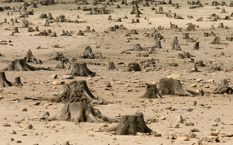
stumps

Almost a decade ago, I (co-) wrote a paper examining the socio-economic correlates of gross, national-scale indices of environmental performance among the world’s nations. It turned out to be rather popular, and has so far garnered over 180 citations and been cited in three major policy documents.

In addition to the more pedestrian ranking itself, we also tested which of three main socio-economic indicators best explained variation in the environmental rank — a country’s gross ‘wealth’ indicator (gross national income) turned out to explain the most, and there was no evidence to support a non-linear relationship between environmental performance and per capita wealth (the so-called environmental Kuznets curve).

Well, that was then, and this is now. Something that always bothered me about that bit of research was that in some respects, it probably unfairly disadvantaged certain countries that were in more recent phases of the ‘development’ pathway, such that environmental damage long since done in major development pulses many decades or even centuries prior to today (e.g., in much of Europe) probably meant that certain countries got a bit of an unfair advantage. In fact, the more recently developed nations probably copped a lower ranking simply because their damage was fresher

While I defend the overall conclusions of that paper, my intentions have always been since then to improve on the approach. That desire finally got the better of me, and so I (some might say unwisely) decided to focus on a particular region of the planet where some of the biggest biodiversity crunches will happen over the next few decades — Africa.

Africa is an important region to re-examine these national-scale relationships for many reasons. The first is that it’s really the only place left on the planet where there’s a semi-intact megafauna assemblage. Yes, the great Late Pleistocene megafauna extinction event did hit Africa too, but compared to all other continents, it got through that period relatively unscathed. So now we (still) have elephants, rhinos, giraffes, hippos, etc. It’s a pretty bloody special place from that perspective alone.

P1080625

Elephants in the Kruger National Park, South Africa (photo: CJA Bradshaw)

Then there’s the sheer size of the continent. Unfortunately, most mercator projections of the Earth show a rather quaint continent nuzzled comfortably in the middle of the map, when in reality, it’s a real whopper. If you don’t believe me, go to truesize.com and drag any country of interest over the African continent (it turns out that its can more or less fit all of China, Australia, USA, and India within its greater borders).

Third, most countries in Africa (barring a few rare exceptions), are still in the so-called ‘development’ phase, although some are much farther along the economic road than others. For this reason, an African nation-to-nation comparison is probably a lot fairer than comparing, say, Bolivia to Germany, or Mongolia to Canada.

Read the rest of this entry »


%d bloggers like this: