Higher biodiversity imparts greater disease resistance

12 03 2016

fungal infection

Is biodiversity good for us? In many ways, this is a stupid question because at some point, losing species that we use directly will obviously impact us negatively — think of food crops, pollination and carbon uptake.

But how much can we afford to lose before we notice anything bad is happening? Is the sort of biodiversity erosion we’re seeing today really such a big deal?

One area of research experiencing a surge in popularity is examining how variation in biodiversity (biowealth1) affects the severity of infectious diseases, and it is particularly controversial with respect to the evidence for a direct effect on human pathogens (e.g., see a recent paper here, a critique of it, and a reply).

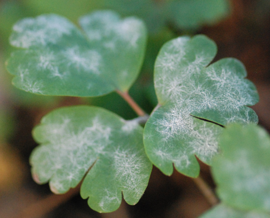
Controversy surrounding the biodiversity-disease relationship among non-human species is less intense, but there are still arguments about the main mechanisms involved. The amplification hypothesis asserts that a community with more species has a greater pool of potential hosts for pathogens, so pathogens increase as biodiversity increases. On the contrary, the dilution hypothesis asserts that disease prevalence decreases with increasing host species diversity via several possible mechanisms, such as more host species reducing the chance that a given pathogen will ‘encounter’ a suitable host, and that in highly biodiverse communities, an infected individual is less likely to be surrounded by the same species, so the pathogen cannot easily be transmitted to a new host (the so-called transmission interference hypothesis).

So I’ve joined the ecological bandwagon and teamed up yet again with some very clever Chinese collaborators to test these hypotheses in — if I can be so bold to claim — a rather novel and exciting way.

Our new paper was just published online in EcologyWarming and fertilization alter the dilution effect of host diversity on disease severity2. Read the rest of this entry »


Cartoon guide to biodiversity loss XXXV

8 03 2016

Another six biodiversity cartoons for you this week (see here for why I provide six each time). See full stock of previous ‘Cartoon guide to biodiversity loss’ compendia here.

Read the rest of this entry »


Environmental Arsehats

3 03 2016

arsehatI’m starting a new series on ConservationBytes.com — one that exposes the worst environmental offenders on the planet.

I’ve taken the idea from an independent media organisation based in Australia — Crikey — who has been running the Golden Arsehat of the Year awards since 2008. It’s a hilarious, but simultaneously maddening, way of shaming the worst kinds of people.

So in the spirit of a little good fun and environmental naming-and-shaming, I’d like to put together a good list of candidates for the inaugural Environmental Arsehat of the Year awards.

So I’m keen to receive your nominations, either privately via e-mail, the ConservationBytes.com message service, or even in the comments stream of this post. Once I receive a good list of candidates, I’ll do separate posts on particularly deserving individuals, followed by an online poll where you can vote for your (least) favourite Arsehat.

There are a few nomination rules, however. Read the rest of this entry »


Bad science

10 02 2016

Head in HandsIn addition to the surpassing coolness of reconstructing long-gone ecosystems, my new-found enthusiasm for palaeo-ecology has another advantage — most of the species under investigation are already extinct.

That might not sound like an ‘advantage’, but let’s face it, modern conservation ecology can be bloody depressing, so much so that one sometimes wonders if it’s worth it. It is, of course, but there’s something marvellously relieving about studying extinct systems for the simple reason that there are no political repercussions. No self-serving, plutotheocratic politician can bugger up these systems any more. That’s a refreshing change from the doom and gloom of modern environmental science!

But it’s not all sweetness and light, of course; there are still people involved, and people sometimes make bad decisions in an attempt to modify the facts to suit their creed. The problem is when these people are the actual scientists involved in the generation of the ‘facts’.

As I alluded to a few weeks ago with the publication of our paper in Nature Communications describing the lack of evidence for a climate effect on the continental-scale extinctions of Australia’s megafauna, we have a follow-up paper that has just been published online in Proceedings of the Royal Society B — What caused extinction of the Pleistocene megafauna of Sahul? led by Chris Johnson of the University of Tasmania.

After our paper published earlier this month, this title might seem a bit rhetorical, so I want to highlight some of the reasons why we wrote the review. Read the rest of this entry »


Cartoon guide to biodiversity loss XXXIV

14 01 2016

Another six biodiversity cartoons for you this week. You might have asked yourself ‘Why six?’ — the number 6 is, of course, the smallest perfect number (i.e., the sum of its aliquot divisors is equal to the number itself: 1 + 2 + 3 = 6), and as a result, my favourite (geek). See full stock of previous ‘Cartoon guide to biodiversity loss’ compendia here.

Read the rest of this entry »


Influential conservation papers of 2015

25 12 2015

most popularAs I did last year and the year before, here’s another arbitrary, retrospective list of the top 20 influential conservation papers of 2015 as assessed via F1000 Prime.

Read the rest of this entry »


Cartoon guide to biodiversity loss XXXII

8 09 2015

Six more biodiversity cartoons — this time, from France. They’re in French to pay hommage to my hosts (and acknowledge their fanaticism for les bandes dessinées), but don’t worry, I’ve provided full translation (see full stock of previous ‘Cartoon guide to biodiversity loss’ compendia here).

“Biodiversity: More and more species threatened. The good news for you is that you’re not endangered. The bad news is that neither are we.” © Roulies

Read the rest of this entry »


Australia’s motto: “Screw the environment!”

2 09 2015
Mmmmm! I love coal!

Mmmmm! I love coal!

An article originally posted on ALERT by April Reside (with permission to reproduce).

The Conservative Tony Abbott government in Australia is proposing alarming changes to Australia’s Environmental Protection and Biodiversity Conservation (EPBC) Act 1999 — a remarkable move that would prevent environment groups from challenging many damaging development projects.

This has all come to a head over the Carmichael Coal Mine — a plan to build a massive mine in central Queensland in order to export 60 million of tonnes of coal to India each year.

Coal, of course, is the dirtiest of all fossil fuels, and India’s plan to burn it by the shipload for electricity is bad news for the planet.

The Abbott government is in a tizzy after after a community organization, the Mackay Conservation Group, challenged the approval of the Carmichael Mine in Australia’s Federal Court.

The community group says Environment Minister Greg Hunt didn’t properly consider the impact the mine would have on two threatened species, the yakka skink and ornamental snake.

The mine site also sustains the largest population of the southern subspecies of the black-throated Finch, which is endangered.

The implications of the mega-mine go well beyond a few imperilled species. If the mine goes ahead, it will be one of the biggest in the world — and the emissions from burning its mountains of coal would cancel out all gains made from Australia’s current emissions-reduction strategy.

On top of the frightening precedent it would set, the Abbott government appears to be double-dealing. Read the rest of this entry »


Scariest part of climate change isn’t what we know, but what we don’t

7 08 2015
image-20150731-18728-1ntffbr

© Nick Kim

My good friend and tropical conservation rockstar, Bill Laurancejust emailed me and asked if I could repost his recent The Conversation article here on ConservationBytes.com.

He said:

It’s going completely viral (26,000 reads so far) in just three days. It’s been republished in The Ecologist, I Fucking Love Science, and several other big media outlets.

Several non-scientists have said it really helped them to understand what’s known versus unknown in climate-change research—which was helpful because they feel pummelled by all the research and draconian stuff that gets reported and have problems parsing out what’s likely versus speculative.

With an introduction like that, you’ll just have to read it!

“It’s tough to make predictions, especially about the future”: so goes a Danish proverb attributed variously to baseball coach Yogi Berra and physicist Niels Bohr. Yet some things are so important — such as projecting the future impacts of climate change on the environment — that we obviously must try.

An Australian study published last week predicts that some rainforest plants could see their ranges reduced 95% by 2080. How can we make sense of that given the plethora of climate predictions?

In a 2002 press briefing, Donald Rumsfeld, President George W. Bush’s Secretary of Defence, distinguished among different kinds of uncertainty: things we know, things we know we don’t know, and things we don’t know we don’t know. Though derided at the time for playing word games, Rumsfeld was actually making a good point: it’s vital to be clear about what we’re unclear about.

So here’s my attempt to summarise what we think we know, don’t know, and things that could surprise us about climate change and the environment.

Things we think we know

We know that carbon dioxide levels in the atmosphere have risen markedly in the last two centuries, especially in recent decades, and the Earth is getting warmer. Furthermore, 2014 was the hottest year ever recorded. That’s consistent with what we’d expect from the greenhouse effect. Read the rest of this entry »


All (fisheries) models are wrong, but some are useful (to indigenous people)

1 08 2015

miracle_cartoonAnother post from Alejandro Frid. (Note: title modified from George Box‘s most excellent quote).

As an ecologist working for indigenous people of coastal British Columbia, western Canada, I live at the interface of two worlds. On the one hand, I know that computer models can be important management tools. On the other hand, my job constantly reminds me that whether a model actually improves fishery management depends, fundamentally, on the worldview that shapes the model’s objectives. To explore why, I will first review some general concepts about what models can and cannot do. After that, I will summarize a recent model of herring populations and then pull it all together in a way that matters to indigenous people who rely on marine resources for cultural integrity and food security.

Models do a great job of distilling the essence of how an ecosystem might respond to external forces—such as fisheries—but only under the specific conditions that the modeller assumes to be true in the ‘world’ of the model. Sometimes these assumptions are well-grounded in reality. Sometimes they are blatant but necessary simplifications. Otherwise, it would be difficult to ask questions about how major forces for which we have no historical precedent—such as the combined effects of industrial fisheries, ocean acidification and climate change—might be altering the ocean. For instance, due to our greenhouse gas emissions, the ocean is warming and contains less dissolved oxygen. These stressful conditions hamper the capacity of fish to grow, and appear to be on their way to shrinking the body sizes of entire fish communities1. If you want even to begin to comprehend what the ocean will look like in the long term due to these effects of climate change, it makes sense to assume, in the ‘world’ of your model, that fishing does not exist, even though you know it does. Of course, you would then acknowledge that climate change probably exacerbates the effects of fisheries, which highlights that you still have to examine the combination of these effects. And that is exactly what an excellent team of modellers did1. Read the rest of this entry »


Ice Age? No. Abrupt warmings and hunting together polished off Holarctic megafauna

24 07 2015
Oh shit oh shit oh shit ...

Oh shit oh shit oh shit …

Did ice ages cause the Pleistocene megafauna to go extinct? Contrary to popular opinion, no, they didn’t. But climate change did have something to do with them, only it was global warming events instead.

Just out today in Science, our long-time-coming (9 years in total if you count the time from the original idea to today) paper ‘Abrupt warmings drove Late Pleistocene Holarctic megafaunal turnover‘ demonstrates for the first time that abrupt warming periods over the last 60,000 years were at least partially responsible for the collapse of the megafauna in Eurasia and North America.

You might recall that I’ve been a bit sceptical of claims that climate changes had much to do with megafauna extinctions during the Late Pleistocene and early Holocene, mainly because of the overwhelming evidence that humans had a big part to play in their demise (surprise, surprise). What I’ve rejected though isn’t so much that climate had nothing to do with the extinctions; rather, I took issue with claims that climate change was the dominant driver. I’ve also had problems with blanket claims that it was ‘always this’ or ‘always that’, when the complexity of biogeography and community dynamics means that it was most assuredly more complicated than most people think.

I’m happy to say that our latest paper indeed demonstrates the complexity of megafauna extinctions, and that it took a heap of fairly complex datasets and analyses to demonstrate. Not only were the data varied – the combination of scientists involved was just as eclectic, with ancient DNA specialists, palaeo-climatologists and ecological modellers (including yours truly) assembled to make sense of the complicated story that the data ultimately revealed. Read the rest of this entry »


Cartoon guide to biodiversity loss XXX 30

27 05 2015

[10.06.2015 update: Because of all the people looking for cartoon porn, I’ve slightly altered the title of this post. Should have predicted that one]

Third batch of six biodiversity cartoons for 2015 (see full stock of previous ‘Cartoon guide to biodiversity loss’ compendia here).

Read the rest of this entry »


Statistical explainer: average temperature increases can be deceiving

12 05 2015

Beating-the-Heat-Without-PowerOver the years I’ve used a simple graphic from the IPCC 2007 Report to explain to people without a strong background in statistics just why average temperature increases can be deceiving. If you’re not well-versed in probability theory (i.e., most people), it’s perhaps understandable why so few of us appear to be up-in-arms about climate change. I posit that if people had a better appreciation of mathematics, there would be far less inertia in dealing with the problem.

Instead of using the same image, I’ve done up a few basic graphs that explain the concept of why average increases in temperature can be deceiving; in other words, I explain why focussing on the ‘average’ projected increases will not enable you to appreciate the most dangerous aspects of a disrupted climate – the frequency of extreme events. Please forgive me if you find this little explainer too basic – if you have a modicum of probability theory tucked away in your educational past, then this will be of little insight. However, you may wish to use these graphs to explain the problem to others who are less up-to-speed than you.

Let’s take, for example, all the maximum daily temperature data from a single location compiled over the last 100 years. We’ll assume for the moment that there has been no upward trend in the data over this time. If you plot the frequency of these temperatures in, say, 2-degree bins over those 100 years, you might get something like this:

ClimateVarFig0.1

This is simply an illustration, but here the long-term annual average temperature is 25 degrees Celsius, and the standard deviation is 5 degrees. In other words, over those 100 years, the average daily maximum temperature is 25 degrees, but there were a few days when the maximum was < 10 degrees, and a few others where it was > 40 degrees. This could represent a lot of different places in the world.

We can now fit what’s known as a ‘probability density function’ to this histogram to obtain a curve of expected probability of any temperature within that range:

ClimateVarFig0.2

If you’ve got some background in statistics, then you’ll know that this is simply a normal (Gaussian) distribution. With this density function, we can now calculate the probability of any particular day’s maximum temperature being above or below any particular threshold we choose. In the case of the mean (25 degrees), we know that exactly half (p = 0.50) of the days will have a maximum temperature below it, and exactly half above it. In other words, this is simply the area under the density function itself (the total area under the entire curve = 1). Read the rest of this entry »


Something rotten from Denmark

22 04 2015

It was just reported in the Guardian that infamous and discredited environmental charlatan, Bjørn Lomborg, who has recently been given the green light to set up shop in Australia after the University of Western Australia‘s Vice-Chancellor, Paul Johnson, extended him an olive branch, and the Abbott-oir government gave him $4 million to do so. Yes, you read that correctly.

It’s telling in today’s political climate that such a man is not only welcomed to a leading (Group of Eight) Australian university by its own Vice-Chancellor, he’s given millions to undermine real science and societal progress by the federal government. It’s an understatement to say that I’m disgusted and ashamed to be Australian today.

I have just received some juicy inside correspondence from the School of Animal Biology at the University of Western Australia sent to the Vice-Chancellor. The School, suffice it to say, is not amused. I copy the letter itself below, as well as an internal e-mail sent to the University’s Heads of School by the Chief Advisor of the University’s Corporate and Government Affairs, Mr David Harrison. Read the rest of this entry »


Cartoon guide to biodiversity loss XXIX

9 04 2015

Second batch of six biodiversity cartoons for 2015 (see full stock of previous ‘Cartoon guide to biodiversity loss’ compendia here).

Read the rest of this entry »


Australia’s perfect storm of negligence

17 03 2015

If, for the purposes of some sick and twisted thought experiment, you were to design policies that would ensure the long-term failure of a wealthy, developed nation, you wouldn’t have to look farther than Australia’s current recipe for future disaster. I’m not trying to be provocative, but the warning signs are too bold and flashy to ignore. Let’s just run through some of the main ones:

1. As the lambasted and thoroughly flawed 2015 Intergenerational Report clearly demonstrates, our current government has no idea about the future threats of climate change. Dragged kicking and screaming into only a symbolic recognition of some ‘distant and currently irrelevant problem’, the Abbott-oir and his intergenerational criminals are well known for killing the carbon-pricing scheme, dismantling the Department of Climate Change, pulling out of major international talks on climate-change mitigation and installing a half-arsed, ineffective policy that will do nothing to stem our emissions. Combine that with comments like “coal is good for humanity“, and it’s easy to see how our current leaders have little idea about the future mess they’re creating.

2. Not content just to kick the shit out of any meaningful climate action, our government has also turned its back on any renewable energy target, and facilitated the fossil-fuel barons to dig more coal out of the ground. While South Australia’s Royal Commission on the nuclear fuel cycle is a welcome candle in the climate change-mitigation darkness here, it is far from becoming a national priority any time soon.

3. As has been well documented, the Abbott-oir ship of fools has also done whatever it can to turn back decades of environmental protections in less than six months of taking office. Everything from opening up national parks for exploitation, failing to protect marine sanctuaries, limiting environmental checks to promoting logging in World Heritage Areas, there is little room for hope that our crumbling environmental system will improve at all in the near to long term. Read the rest of this entry »


Earth’s second lung has emphysema

19 02 2015
© WWF

© WWF

Many consider forests as the ‘lungs’ of the planet – the idea that trees and other plants take up carbon and produce oxygen (the carbon and oxygen cycles). If we are to be fair though, the oceans store about 93% of the Earth’s carbon pool (excluding the lithosphere and fossil fuels) and oceanic phytoplankton produces between 50 and 80% of the oxygen in the atmosphere. For comparison, the terrestrial biosphere – including forests – stores only about 5% of the Earth’s carbon, and produces most of the remainder of atmospheric oxygen.

So there’s no denying that the biggest player in these cycles is the ocean, but that’s not the topic of today’s post. Instead, I’m going to focus on the terrestrial biosphere, and in particular, the carbon storage and flux of forests.

Now it’s pretty well established that tropical forests are major players in the terrestrial carbon cycle, with the most accepted estimates of about 55% the terrestrial carbon stock stored therein. The extensive boreal forest, covering most of the northern half of North America, most of Scandinavia and a huge chunk of Russia, comes in globally at about 33%, and temperate forests store most of the remainder.

That is, until now. Read the rest of this entry »


Cartoon guide to biodiversity loss XXVIII

4 02 2015

First batch of six biodiversity cartoons for 2015 (see full stock of previous ‘Cartoon guide to biodiversity loss’ compendia here).

Read the rest of this entry »


Cartoon guide to biodiversity loss XXVII

31 12 2014

Here are the last 6 biodiversity cartoons for 2014 because, well, why not? (see full stock of previous ‘Cartoon guide to biodiversity loss’ compendia here).

Read the rest of this entry »


Influential conservation papers of 2014

22 12 2014

splash2Another year, another arbitrary retrospective list – but I’m still going to do it. Based on the popularity of last year’s retrospective list of influential conservation papers as assessed through F1000 Prime, here are 20 conservation papers published in 2014 that impressed the Faculty members.

Once again for copyright reasons, I can’t give the whole text but I’ve given the links to the F1000 assessments (if you’re a subscriber) and of course, to the papers themselves. I did not order these based on any particular criterion.

Read the rest of this entry »